Branding
Investing in a strong brand is not just about aesthetics; it's a strategic imperative that lays the foundation for long-term success and sustainability in the market.


PALCI
PALCI is a Partnership for Academic Library Collaboration & Innovation, with a membership consisting of 71 academic and research libraries, in Pennsylvania, New Jersey, West Virginia, and New York. They approached our team to rebrand a very outdated look and feel. Our thorough design process established a new look and feel, powered by a collection of bright, colorful shapes interlocking. This form speaks volume to their collaborative intentionality and remained abstract enough to see different elements coming together depending on the viewer (e.g. a ball of yarn, hands in a circle, a planet, etc.)
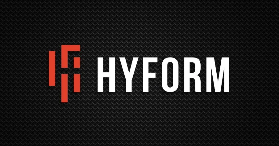

HYFORM
The brand for Hyform was established to give a bold, modern presence that would appeal to a broad spectrum of users (students, businesses, and academics). The interlocking iconography was intended to capture the H and F from the name while simultaneously showing an abstraction of systems/teams coming together to solve problems.


Knowted
The logo for Knowted was designed to give an immediate sense of a user-experience and tactical approach to learning. The bold typeface with the loose (!) and highlighted area lends itself to a juxtaposition of work and play.

AguaVivar
This elegant and vibrant logo was created to be a premium brand for a growing franchise. The brand and its physical locations give customers organic and free-flowing energy.


Windswept
The logo for Windswept was inspired by the natural, invisible power of the wind as it moved across the letters, cutting into the typeface in a forward motion. Windswept is a destination for eco-friendly cafes and other activities in State College, PA.


cultivate
Cultivate is a company that helps their clients dig deep to realize the potential of their organization's culture change. This clean brand has a stacked icon resembling progressive growth from the ground up. This spade-like shape on a topographic map gives a more natural sense to this generally corporate design.

Bass
Bass Mechanical, now (Bass), went through a thorough rebrand process to modernize the brand, aligning the visual identity with the company's values, mission and vision. The (B) is symbolic of the last name of the family "Baum", as well as hiding a bass fish (flipping) up out of the water, symbolic of the previous logo.
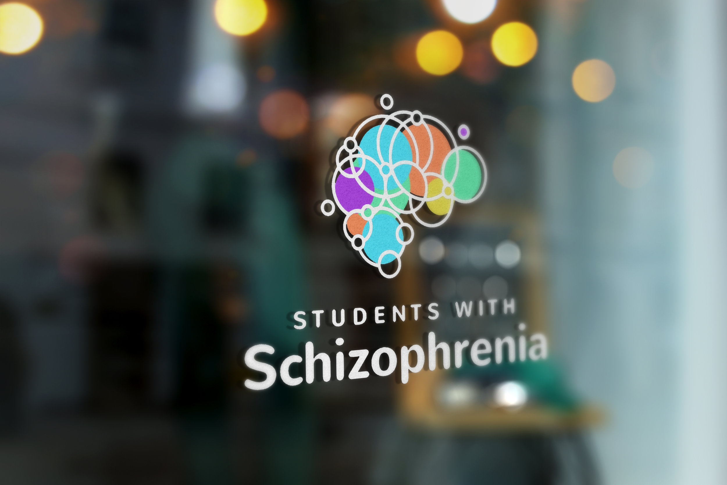
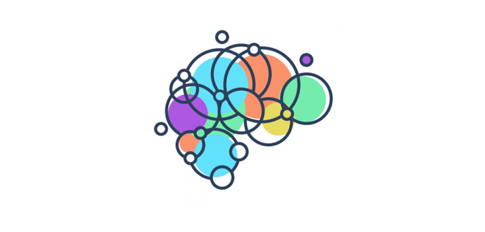
Students with Schizophrenia
The logo for Students with Schizophrenia was donated / designed for a young, ambitious PSU student looking to make an impact, and be a supportive group for students looking for a community to lean into. The logo represents an abstract brain... beautifully complicated and colorful in a playful yet approachable manner.
that.
Networking and time socializing is an important part of life, both personally and professionally. So I started a brand so simple that the name itself is both quirky and to the point... that group. A weekly hangout in State College, PA with no real intention except to bring people together. So in order to allow people to make it their own, I named it that...just using a clean black and white color palette and a font that speaks volume
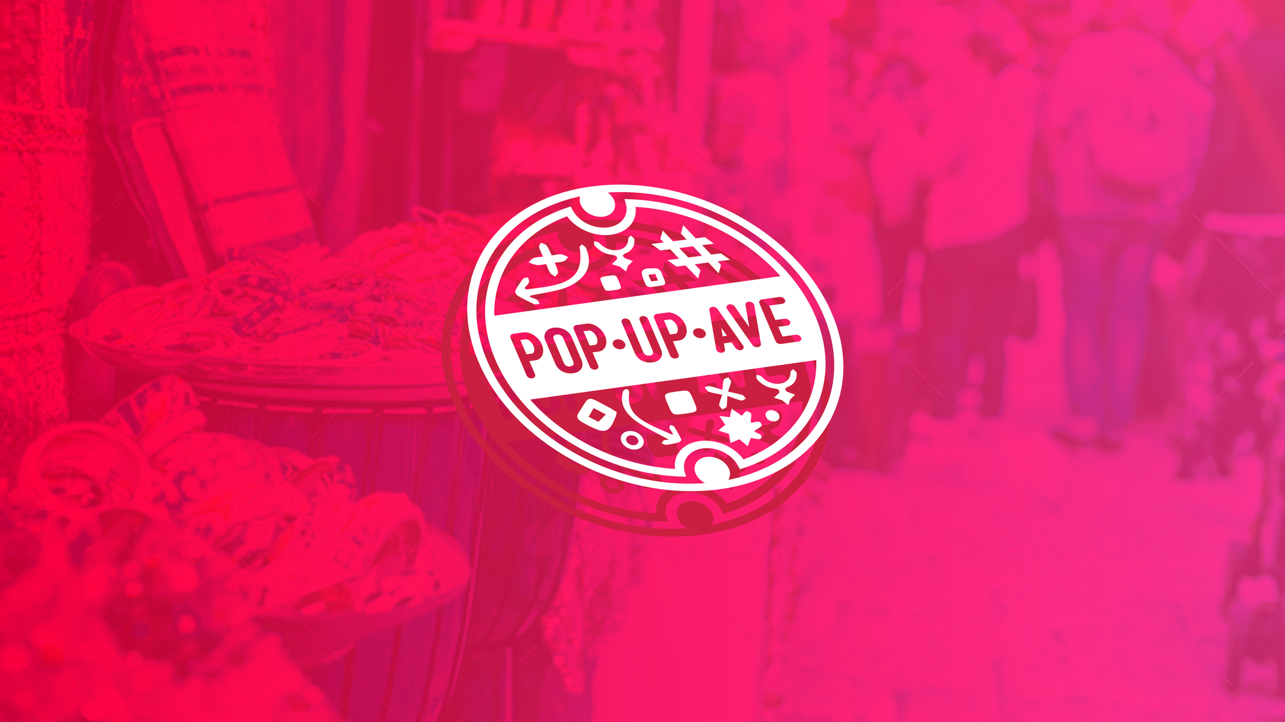

POP UP AVE
Pop Up Ave was designed for a startup in State College, PA – an annual urban flea for various vendors, musical shows and beyond. Leverage the street look and feel for both men and women of various ages, I designed this brand to be a simplified version of a man cover. Using this object will give flexibility for future projects to change up the shapes (textures) as well as adding in a location to be truly vernacular to each event.
> Pop Up Ave Website
Action Surge
Action Surge was developed for a group of passionate entrepreneurs who are driven by helping people put their ideas into action! Whether it's on a corporate level or personal level, the Action Surge brand was designed to be a bold, powerful burst of energy. This custom font with an energetic gradient work hand-in-hand to give participants a 'stamp' of energy, with a subtle arrow pointing up, giving a sense of driving forward
TEDxJNJ No Boundaries
During the second year of working with TEDxJNJ, we decided to push the limits on the type of brand and experience, differentiating it from all previous events. No Boundaries is the first event that will have a "logo" as opposed to various elements or a font-treatment. This energetic blast of paint and space explode out of constraints of the box. The logo and event are designed to push participants beyond their normal comfort zones and continue taking ownership over their ideas, and putting them into action, continuing to drive Johnson & Johnson to be one of the best companies in the world.
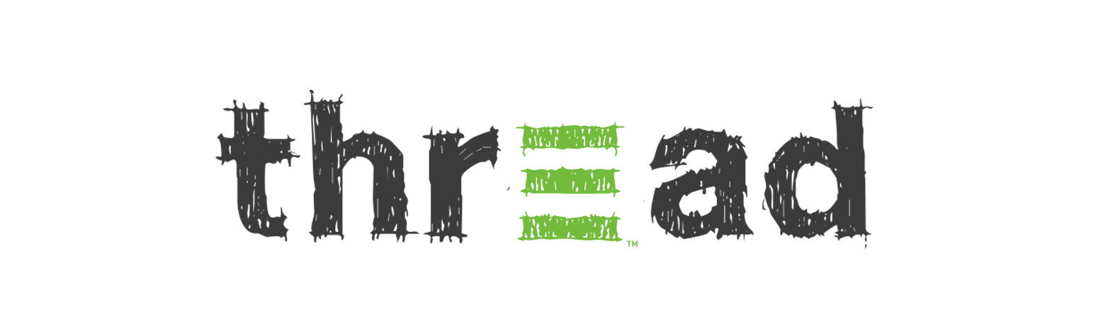
thread
Thread is a unique business tackling some challenging world problems. Working primarily in Haiti, thread works closely to empower the local community through the repurposing of plastic bottles into fabric. The logo, with its weaving texture, has a highlighted (E) in the middle which symbolizes this transformative, step-by-step process they developed.

Insurance Skout
Insurance Skout is a unique opportunity to develop something fresh in the insurance industry. Client desired a character, similar to that of Github or Hipmunk, in which users can connect with the brand on a personal level. After exploring countless animals, we decided to go with a manta ray. We narrowed the animal by choosing something that is able to float on a page, rarely used, and has natural blues (whether it was the animal itself or its environment). I think I'll name him... Ray!

Coffee Quarter
Coffee Quarter is a newly renovated coffee and lounge in MD. The logo was designed to revamp the existing companies brand. The icon, a C & Q merged to form a steaming mug of coffee is a common icon found on tables, mugs, shirts, packaging and more.

co.space
co.space, my personal company I launched with a close friend, Spud Marshall, is a home for changemakers. Launched in 2013, the cospace houses 20 students and young professionals, looking to make a positive influence in the world, on a personal, community and global scale.

freshly
freshly was developed to assist in the growing entrepreneurial culture in State College in partnership with a student who had the idea to develop a healthy, local, food delivery system. The logo was created to give clients a clean and refreshing feel. The apple and juicy drip help give people a more tangible relationship with the logo.

AutoLion
EC Power, a Lithium-ion Battery Simulation company needed an additional brand to assist in marketing their diverse products and services. AutoLion was born to be readily adaptable to adding additional programs such as ST, 2D, and 3D. The color scheme aligns nicely with their existing brand.

GREEN TOWERS
The Green Towers logo was designed to help out a new student startup at PSU. Green Towers needed a clean, modern, and fun logo to brand clothes, business cards, as well as a web presence. The logo was designed within a towered-shape box encapsulating an organic leaf/tree metaphor.
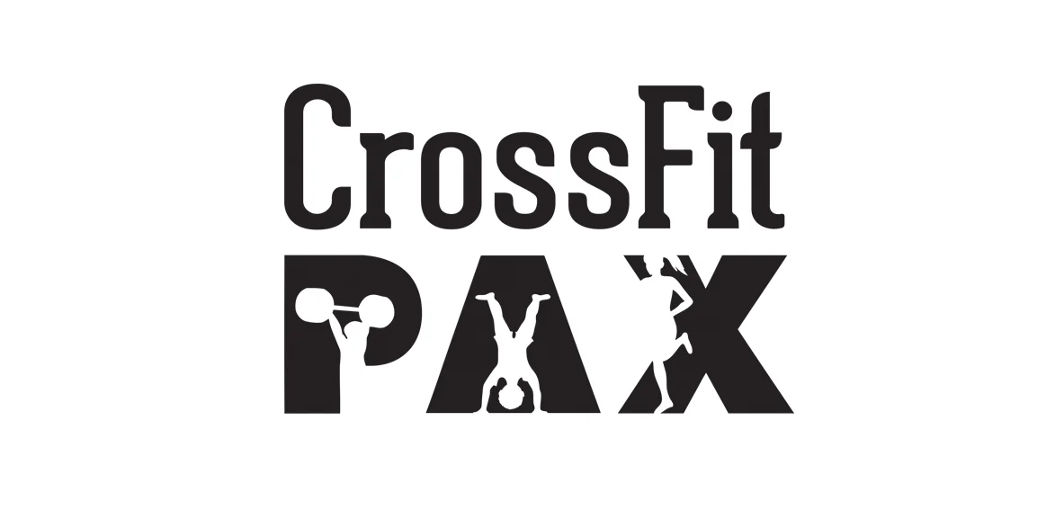
CrossFit PAX
CrossFit PAX, a Maryland-based crossfit gym, is home to several hundred members. A family-focused owner, they wished for their logo to have men, women, and children all incorporated into the type-face. Logo appears on clothes, all printed material, and painted on a large wall inside their facility.
crossed clouds
crossed clouds was another identity developed to help build the startup community in State College, PA. This student run company built websites, and wanted to capture an easy and clean logo.

New Leaf Initiative
New Leaf Initiative, a 501(c)3 non-profit that sits close to my heart has been through several iterations of branding directions. This new mark has the intensity and passion that most closely represents the possibilities of this organization. Being a community-focuse group that isn't afraid to get down and dirty, what better logo then the mixture of ideation (light bulb) and paint splatters.

City Youth Sports
City Youth Sports logo was rebranded to present a fun, exciting and diverse approach to sports and exercise. The color scheme is readily adaptable for jersey, shirts, and other branding materials.

FLY
The FLY logo was developed for an startup DJ entrepreneur in NYC. The design is clean, airy, and sharp... the large wing element on the left side of the icon breaks from the norm, and may also be removed it may be used in other marketing materials.

Surge Business Development
This unique logo of a crashing wave or 'surge' of energy was designed for a small company that specializes in granting students real-time experience with local clients.
DJS FIRST PROJECT
DJS First Project was developed in conjunction with the previous logo, FLY. This logo was designed for a DJ competition, the icon represents a turntable with controls neighboring the circular form.

Parks & People
Parks & People logo was designed for Global Programs at PSU. Although the shown icon is not the final logo, the process revealed some very unique and organic forms. The logo has both a male and female figure hidden in the middle, revealing a heart, binding them together. The people, also forming a tree and a community near the roots provide the sense of a full community atmosphere.
The Finance Coach
The Finance Coach Logo was developed for a Corporate Finance professor at PSU. An avid baseball fan, the client desired a 'mentoring / coaching' icon as a simple silhouette.

Educate 20/20
This unique project was done in collaboration with New Leaf Initiative in State College PA. The logo was designed to give a clean, progressive, 3D-drive towards the viewer. This educational road trip in an RV across the nation, also required a large, custom RV wrap with additional graphics.

NAVY CYP
This logo was developed in partnership with the NAVY YSP. Although the icon was never completed, it was a healthy and successful process to shine light on the need for a larger rebranding need. The logo, designed have traditional values was relaxed to have a childish / playful element to it as well.

Small Batch
A logo developed in partnership with Chris Danilo. This icon was designed to be a strong, simple, hexagonal icon. Small Batch is a small gathering of young professionals looking to break the norm of the bar scene, meet up and have more meaningful conversations with top shelf whiskey.

PURE Management Group
This unique and refreshing logo was designed for a talent management company several years ago. The clean water splash rising from the (UR) was a metaphor for self activation and confidence.
Calvary Global Kids
A logo developed designed to have a variety of different elements within the logo as a whole. Various pieces within the silhouette of a child's footprint, make up concepts such as health, play, music, spirituality and more.

Truth Bible Church
A logo for Truth Bible Church was developed as a study for possible rebranding. Although the client decided not to move forward with rebranding the church, the process was successful and developed a variety of potentials in case they choose to move forward in the future. The logo, a silhouetted cross on a large window was a clean and simple metaphor for them to carry into other marketing materials.

Reid & Scott
This logo was designed for a mens' fashion company that sold simple and elegant accessories. The clean R S were merged together to create a new dynamic icon that could be readily placed on various clothing and accessory items.

CO.SPARK
This quick logo was designed in about 15 minutes for a fast approaching presentation! Originally designed to be part of the co.space brand, co.spark was going to be a fun coworking space, which eventually evolveed back into being New Leaf Initiative. The strong lettering and small popping circles help give it a fun energy, but still keep the logo modular or 'square' in shape.